Highlight your impact on your homepage
The main reason you should give off a positive first impression is that you want website visitors to turn into donors. So, on your homepage, focus on highlighting the impact your organization makes. For instance, this could include showing the results from a fundraiser or highlighting a unique program. Think about what kinds of reassurances you could provide on your homepage.
Here’s one organization that does a great job of doing this:
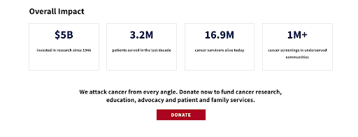
The American Cancer Society, a nonprofit specializing in cancer research, shows off their overall impact on their homepage, making a great first impression. As you can see, The American Cancer Society has invested $5 billion in research. They also served more than 3.2 million patients in the last decade and gave more than 1 million cancer screenings to underserved communities. These are very valuable numbers, making it much more likely that a website visitor would want to volunteer or donate. After all, they do great work!
On your nonprofit’s website, show off some of your work! Include results that show exactly what a meaningful contribution can make. Highlighting valuable data helps convince people to support your cause.
Add engaging elements to grab visitors’ attention
You don’t want someone to land on your website and leave right away out of boredom. Avoid this by ensuring your nonprofit’s homepage has some engaging elements to keep people interested. Videos, interactive content, and exciting copy are all great ways to engage your audience. If you need help with your copy, take a look at Loganix’s copywriting services to help make your website copy engaging and SEO-friendly.
Let’s take a look at a couple examples of nonprofit sites with engaging content on their homepages for inspiration.
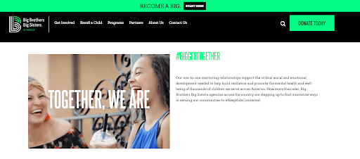
Big Brothers Big Sisters, a youth mentoring organization, uses video content to engage visitors on their homepage. Under the #BiggerTogether banner, Big Brothers Big Sisters shows a video of kids and adults in the program. Inspirational copy flashes across the screen, including phrases like “Potential is in every kid.” This is an inspiring element that leaves a great first impression. On your homepage, use video to inspire your website visitors and demonstrate the purpose of your cause. Doing so will get your audience excited about your work and convince them to donate or volunteer.
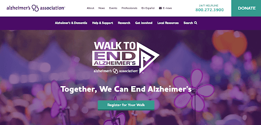
Similarly, The Alzheimer’s Association uses inspiring copy on their homepage. In the image above, you can see that the header says “Together, We Can End Alzheimer’s.” This is an inspirational message that makes a great first impression. It tells the website visitor that they have a part to play when it comes to ending this disease. In other words, it makes a great first impression and encourages people to make donations.
Make sure the next step is simple
Once someone lands on your homepage, you want to direct that person to your donation pages, programs, or contact options as quickly as possible. Therefore, make it convenient for your website visitors to take the next step. This is part of providing a positive user experience and respecting your visitors’ time.
There are several ways you can help visitors take that next step:
- Provide a sophisticated search tool that will take them to the information they need
- Make your contact options visible so they can get in touch
- Create an easy-to-use navigation menu to help them find what they’re looking for
- Give a clear call to action that tells them what to do next
- Provide an online donation tool that makes it easy for them to make a gift
Let’s take a look at some organizations that implement this strategy well.

American International University in Kuwait helps visitors get in touch from their homepage. As you can see above, there are three CTAs for users to click and find what they need. People looking for a specific program, people ready to apply, and people wanting more information about the university all have a place to go to take the next step. Offering several CTAs that target different types of people makes a great first impression.
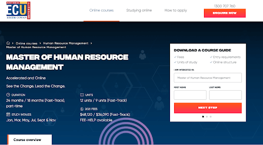
Edith Cowan University in Australia makes it easy for prospective students to register interest in the Master of Human Resource Management course. As shown in the image above, ECU offers a downloadable brochure in exchange for a user’s contact information. Visitors just have to make a few clicks, and then they get a course guide. This also provides the university with interested students’ contact details so they can stay in touch. On your website, consider offering downloadable resources people can access quickly and easily.
Display positive reviews on your homepage
If you’ve received positive reviews or testimonials from volunteers or those you served, highlight these on your homepage. This will improve your reputation and show potential donors you’re great at what you do. While star-based reviews help website visitors compare different options directly, most nonprofits typically benefit from longer testimonials. These provide more context about the impact your services had.
Let’s look at examples of businesses/organizations that show off their reviews on their homepages.

FreshBooks, an accounting software company, displays reviews as well. As you can see, they have a review from a small business owner who says FreshBooks made life much easier. This is great for new website visitors to hear. Since FreshBooks’ audience is made up of mostly freelancers and small business owners looking to save themselves time while doing their own accounting, this review builds trust and gives a great first impression. For your own website, consider gathering longer testimonials for your homepage. This will give your website visitors more context about what you do and how well you do it, making it more likely for them to support your organization.
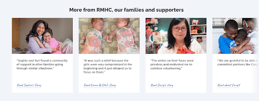
Finally, the Ronald McDonald House, a nonprofit dedicated to supporting families with sick children, uses testimonials to make a great impression on their homepage, too. Toward the bottom of their homepage are a series of quotes from families who have been helped by RMHC. Offering these quotes and introducing website visitors to the people that RMHC has helped builds trust. On your website, show off testimonials from the people you serve. Putting faces and names to the people who benefited from your services will encourage visitors to engage with your nonprofit.
Use images to help homepage visitors connect with you
Images are effective for telling the story of your organization. The right images can help your website visitors feel more connected to your organization. So, on your homepage, you’ll want to use effective imagery that reflect the good work you do. Here are a few different ways you can do this:
- Use images of your staff to humanize your organization’s work
- Create illustrations, diagrams, or infographics that help website visitors better understand what you do
- Showcase images of people who represent your volunteers or audience to make them feel welcome
Let’s take a look at an example of a website that uses this tactic well for inspiration.
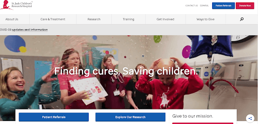
St. Jude Children’s Research Hospital, a leading children’s cancer research hospital, uses great imagery on their homepage. Their hero image rotates through various photos of charity marathons, doctors and patients, and more. For instance, in the above screenshot, there’s an image of a young patient being celebrated with several nurses. This image helps inspire website visitors and encourages them to donate, as it humanizes the people behind the charity. On your website, use authentic images of your team members, volunteers, or the people you serve. Doing so will give a great impression and encourage more support.
Showcase relevant awards or partnerships
If your organization has received certain qualifications or awards, show them off on your homepage! Certificates, awards, and accolades highlight the fact that you’re making a difference. Showcasing these on your homepage is a great way to earn visitors’ trust.
Let’s take a look at an example of a website that uses this tactic well.
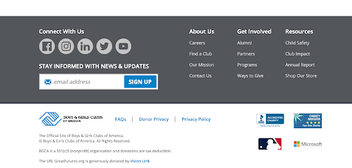
The Boys and Girls Club of America, a nonprofit organization that provides after-school programs for young people, shows off some of their awards and qualifications on their homepage. As you can see above, there are a few things to note. First, the Boys and Girls Club is a charity that has been accredited by the Better Business Bureau. Second, they have received a four-star rating from Charity Navigator. Both of these awards show that the Boys and Girls Club is a legitimate organization worth donating to. Furthermore, the Boys and Girls Club shows that they have partnerships with both Microsoft and the Major Baseball League, which adds to their reputability.
Showing off these awards and partnerships is a great way to build trust with website visitors. It shows that you are well regarded, leaving a great impression and building trust with prospective donors and volunteers. On your website, show off your awards and partnerships to achieve a similar effect.
Summary
Your homepage is like the virtual storefront of your nonprofit, so it needs to give off a great impression if you want to gain more support. We’ve outlined several different ways you can ensure your homepage gives a great first impression. In short, this includes showcasing reviews, using engaging website elements, having great images, and more.
Need more help with managing and marketing your nonprofit? Check out the Nonprofit Hub blog. They have articles on getting more grants, maximizing your social engagement, and more.
*This spotlighted blog post is courtesy of Loganix
About the Author
Adam Steele is the COO at Loganix, an SEO fulfillment partner for agencies and marketers. We build easy-to-use SEO services that help businesses scale. If you liked this article, please check out our SEO guides and templates on the Loganix blog.
The post 6 Ways to Ensure Your Homepage Gives a Great First Impression appeared first on Nonprofit Hub.

0 Commentaires